1. Context
Reality Models & Talent is a Kalamazoo, Michigan-based lifestyle/commercial modeling and talent agency specializing in print media, runway, promo, voiceover and on-camera talent.
Founder and owner Kristi Fitts has over 30 years of experience in modeling and acting. To put it simply, she knows what she’s doing and it was an absolute pleasure to work with her.
2. Goals
According to Kristi, RMT’s website needed a “face lift”, and we were excited to do just that. The goals of this project were to:
- Create a website that showcases RMT in the best light.
- Guide new potential models and clients to contact RMT.
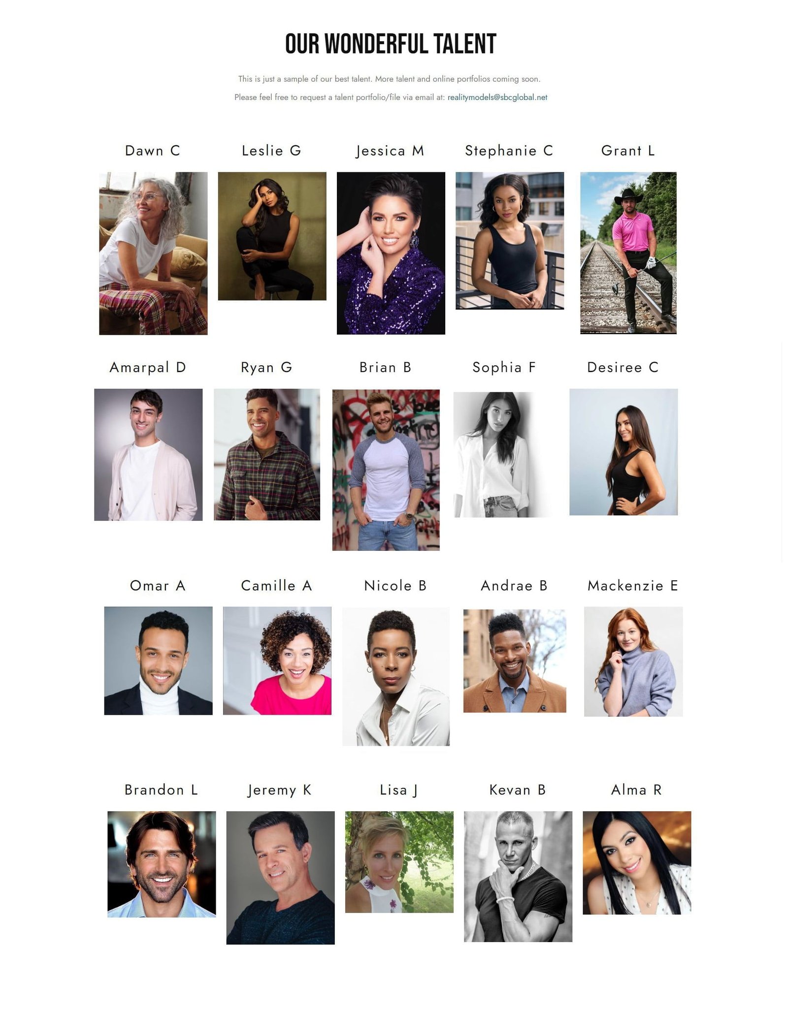
- Create a page that showcases the best faces of RMT.
- Create a new brand identity for RMT using different fonts and colors.
- Design a new and modern logo for RMT.
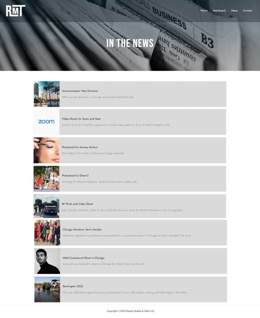
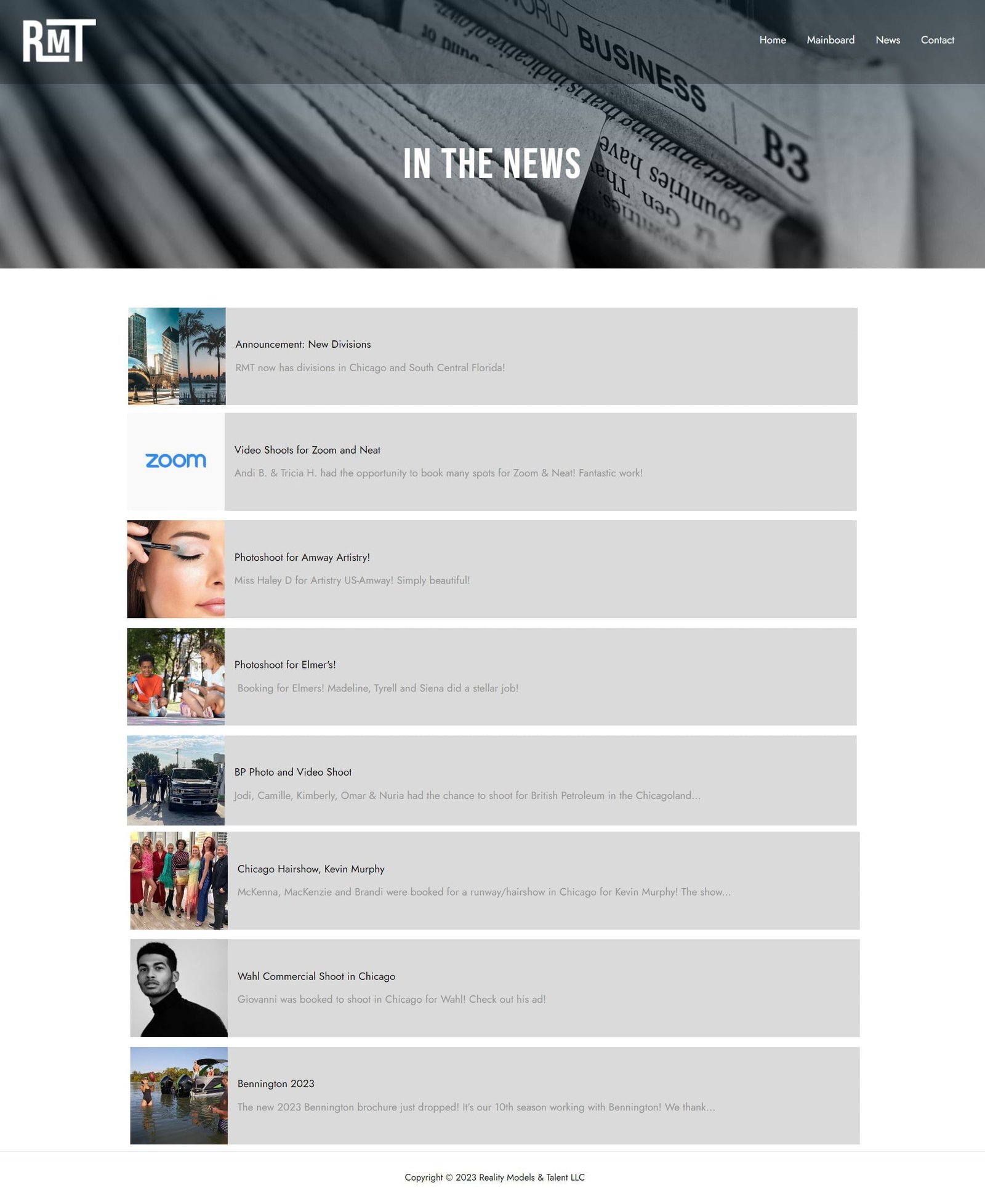
- Create a platform for RMT to post news about the latest happenings in the RMT world.

3. Colors
#FFFFFF

#0E0E0E

Initially we did a lot of experimenting with different colors. We wanted to give RMT a bold color to enhance the brand, but nothing ended up feeling right.
After this we came to the decision that going for a black and white theme was our best option. Being black and white gives the site a feeling of simplistic yet intentional design.
Going black and white also gave us more creative freedom to experiment with other design elements without them feeling too overwhelming.
Making a black and white site means being as intentional as possible with other elements of design in order to make an attractive and fun user experience.
4. Fonts

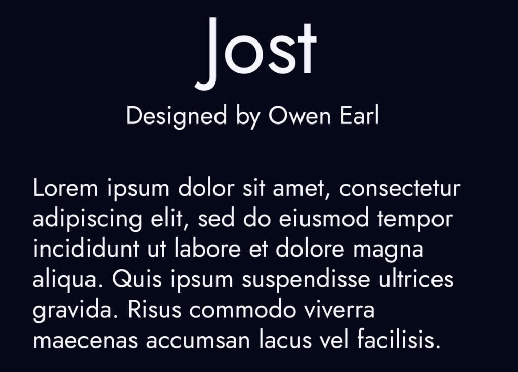
Choosing fonts can feel overwhelming at times but it is an exciting part of design. This is where you really start to create a brand identity for the website.
We wanted to create a brand identity that is modern yet sophisticated and that is how we decided on Bebas Neue and Jost.
They are a great combo, Bebas Neue serving as an attention seeking primary font and Jost as a simple and classy body copy font.
5. Logo

The first phase
Before we even chose RMT's fonts we knew we wanted to make a logo that used Reality Models & Talent's lettering "RMT" for their logo. We started by simply typing out the letters RMT just to have a good look at it.

"RMT" in the font Bebas Neue
Once we decided on our primary and secondary fonts, the logo process was pretty straight-forward. Since "RMT" was the main focus for the logo we didn't feel the need to do anything too design-heavy.

Final logo
We created lines extending from the letter R and T in order to create a frame for the M standing for Models, which is the brand's main focus.
6. Website Structure
RMT’s website consists of 4 pages.
- Home – To give basic information about the company and drive users to take action.
- Models – To give potential clients and others a view of some of RMT’s best models and talent.
- News – To give users an idea of what RMT has done and is doing.
- Contact – To allow models and clients alike to contact Kristi.

